
An exhibition of early colour printing in Germany shines a light on the ways in which technology jump-started a revolution in image making. The British Museum show is curated by Dr Elizabeth Savage, whose research makes a radical contribution to an understanding of colour in woodcuts.
An exhibition of early colour printing in Germany shines a light on the ways in which technology jump-started a revolution in image making. The British Museum show is curated by Dr Elizabeth Savage, whose research makes a radical contribution to an understanding of colour in woodcuts.
Friedrich and Peutinger’s glittering exchange jump-started colour printing on a scale that we are only now beginning to appreciate
Elizabeth Savage
The fearsome dragon is dead, its body contorted and mouth hanging open. Above it, a triumphant St George sits astride a splendid horse. He wears full armour, his legs thrust forward, spurs glinting and lance held high. Atop his helmet, impossibly elaborate plumes and feathers cascade upwards and outwards. In the background, a city perches on a mountain top, silhouetted against a glowering sky.
This opulent image, worked in black and gold on a blue background, is one of the earliest European examples of colour printing used in fine art. It was created in 1507 by Lucas Cranach the Elder (1472–1553) at the request of his patron, Friedrich III, Elector of Saxony. Artisans working for Cranach, whose initials are worked into the design, used two wood blocks (black and gold) to print his masterful design of a horse and rider on to paper pre-painted with indigo. The medieval imagery contrasts with the strikingly modern Renaissance technology.
Cranach’s print is one of 31 German Renaissance woodcuts and a single drawing currently on display at the British Museum in an exhibition of early colour printing. All come from the British Museum’s collection but few have been shown to the public before. Together, they chart the ways in which advances in early print technology opened up new avenues for artists in creating a sense of movement, depth and opulence not possible in black and white.
The exhibition German Renaissance Colour Woodcuts has been curated by Dr Elizabeth Savage (Faculty of English and Department of History of Art). Her pioneering research into archival collections in Germany and the UK, combined with her detailed grasp of the medium of woodblock printing, challenges accepted thinking about the use of colour in woodcuts, a craft-based technology associated almost exclusively with black-and-white or monochrome images.
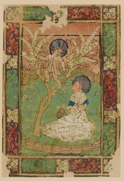
When colour does appear in early woodcuts (for example St Dorothea and the Christ-Child, c.1450-1500) it has generally been applied by hand as a secondary process, often as a wash to draw attention to a significant aspect of the design. Given the considerable technical difficulties of colour printing using wood blocks, it was long assumed that colour printing did not develop on any significant scale until 1700, when Jakob Christoff Le Blon (1667-1741) invented a way to print all natural colours using only blue, red, yellow and black. His method became our CMYK: cyan, magenta, yellow, ‘key’ (black), following his order. Scholars thus assumed that early colour prints were extremely rare and judged them to be unrepresentative ‘outliers’.
Close analysis of colour images by Savage now reveals that, throughout the 1500s, thousands (and perhaps tens of thousands) of colour prints were in circulation in European countries. Furthermore, the range of colour woodblock prints in production varied from costly images, commissioned and collected by wealthy patrons, to more affordable ‘mass-produced’ prints designed to decorate the surfaces of furniture and the interiors of homes whose owners hankered after the latest styles of intarsia and marquetry – effects created by laborious and highly skilled inlay techniques.
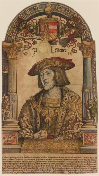
One reason why so many colour prints have hidden in plain sight is that colour can be mistaken for paint. When the surfaces of prints are examined by an expert eye a different story may emerge. For instance, the pressure of the press often leaves tell-tale marks like indenting the design into the paper, forcing ‘ink squash’ into a raised outline, even giving the paper an almost sculptural relief. Savage collaborated with Gwen Riley Jones, a specialist in imaging gold at the University of Manchester, to document the surface texture of the portrait of Holy Roman Emperor Charles V (1519) by Hans Weiditz (c.1500–c.1536). It can now be identified as the sixth image printed with gold in early modern Europe.
The development of colour printing may have been technology-led, emerging from the workshops in the German cities of Augsburg and Strasbourg, among others, where competitive, innovative printers developed new ways to make their books stand out. But, in order to flourish, these advances required the backing of rich and powerful individuals whose status was closely tied to the conspicuous (and competitive) consumption of the latest in luxury goods, from textiles to prints.
“The British Museum holds one of the world’s largest collections of colour prints, including unique examples from late medieval and early modern Germany. Early printers vied with each other to achieve stunning colouristic effects – 500 years before the advent of Photoshop,” says Savage. “We think of prints as being exactly repeatable black outlines on white paper, but some survive in many as 30 very different palettes. Their printers developed inks in royal blues, baby pinks, dusky oranges, lush greens, rich burgundies to create endless variety and unprecedented three-dimensional effects.”
Three prints, displayed side by side, illustrate how rivalry between members of the ruling elite stimulated important developments in colour printing. When in 1507 Friedrich III in Wittenberg sent images by Cranach of “knights printed from gold and silver” to his friend and competitor collector, the imperial advisor Konrad Peutinger in Augsburg, he created a friendly contest between two major artistic centres with artists and artisans stretching their skills to the limit in the quest for the most impressive image.
In response to the receipt of Cranach’s St George, Peutinger sent Friedrich a pair of larger colour woodcuts of St George and Maximillian I on horseback designed by Hans Burgkmair the Elder (1473–1531). With these woodcuts, Peutinger demonstrated that his Augsburg artists and craftsmen were able to outdo Frederick’s ostentatious effort. “Friedrich and Peutinger’s glittering exchange jump-started colour printing on a scale that we are only now beginning to appreciate,” said Savage. “It’s mind-boggling that one of Peutinger’s technicians corresponded directly with the Holy Roman Emperor about colour printing. Like Cranach’s nearly 24-karat gold printing ink on flimsy paper, it suggests the incredible value of these vivid breakthroughs.”
That extraordinary, short-lived, pre-Reformation heyday is thought to be the whole story, but Savage’s research recasts it as a short chapter. Dozens of colour impressions of German prints were known, by just a few artists, from the 1510s. This exhibition hints at the thousands of colour prints, circulating in perhaps tens of thousands of impressions, which were made and used across Germany. Rather than dying out before the Reformation, later European adaptions attest that the craft knowledge and market demand survived for generations and even spread abroad.
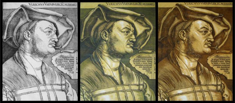
All prints are team efforts, with the artist normally considered the main producer. In the exhibition curated by Savage, the printer is the star player. Two colour impressions by Albrecht Dürer (1471–1528) and one by Hans Holbein (c.1497–1543) are on display, but neither ever designed a colour print. Instead, printers commissioned others to design and cut tone blocks to accompany the great masters’ ‘normal’ woodcuts. As a woodcut, Dürer’s portrait of Ulrich Varnbüler (1522) is a 16th-century German masterpiece; as a colour print, it’s a triumph of 17th-century Dutch marketing.
The exhibition’s focus on printers, not artists, expands an apparently small and sporadic fine art movement into an ever-growing wave. Savage said: “People prayed with them, collected them, learned from them, decorated with them, upgraded cheap wooden furniture with them. Few were as stunning as Cranach’s golden, saintly knight, which is precisely the point. We’ve forgotten that colour woodcuts were normal, not exceptional, in the ‘golden age’ of print.”
German Renaissance Colour Woodcuts is on display in Room 90 on the fourth floor of the British Museum until Wednesday, 27 January 2016.
Inset images: Anonymous (German), St Dorothy of Caesarea and the Christ-child in an Apple Tree, c.1450-1500, British Museum 1895,0122.18, presented by William Mitchell © The Trustees of the British Museum and courtesy of the Centre for Heritage Imaging and Collection Care, University of Manchester; Attr. Hans Weiditz, Holy Roman Emperor Charles V, 1519, British Museum 1862,0208.55 © The Trustees of the British Museum and courtesy of the Centre for Heritage Imaging and Collection Care, University of Manchester; left: Albrecht Dürer, Ulrich Varnbüler, 1522, British Museum 1895,0122.739, presented by William Mitchell, centre and right: later editions printed with new tone blocks by Willem Jansz. Blaeu, c.1620, British Museum 1857,0613.345 and 1857,0613.345, © The Trustees of the British Museum.

The text in this work is licensed under a Creative Commons Attribution 4.0 International License. For image use please see separate credits above.


