Negative space is magical – create it, do not just fill it up!
Timothy Samara
Consistent typefaces and appropriate use of typography will maintain our strong visual identity.
Typographic style
Our typographic style is strong, clear and simple.
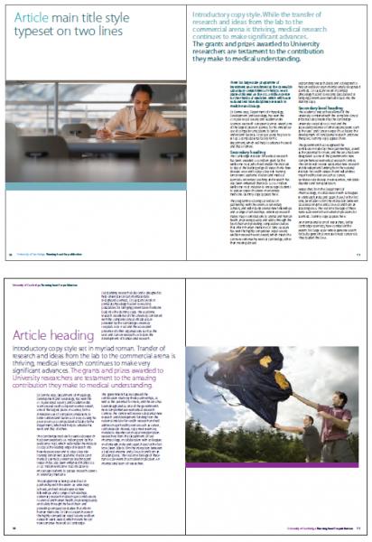
The design grid is used as a versatile, underlying horizontal structure for typography. Headlines should be prominent and limited to a small number of words.
Introductory text, paragraphs and quotations or facts can act as a summary of the content or key messages.
Body copy is generally typeset ranged left, ragged right. Never justify text.
The recommended minimum point size for body copy on an A4 page is 11 point set on 13 point leading.
The importance of good typography
"As the saying goes, type is a beautiful group of letters, not a group of beautiful letters." Matthew Carter
"Typography is two-dimensional architecture, based on experience and imagination, and guided by rules and readability. And this is the purpose of typography: The arrangement of design elements within a given structure should allow the reader to easily focus on the message, without slowing down the speed of his reading." Hermann Zapf
"Typography is what language looks like." Ellen Lupton
"Typographical design should perform optically what the speaker creates through voice and gesture of his thoughts."El Lizzitsky
Design tips
We aim to engage people by presenting our words and messages in a contemporary and clear way. Unnecessary graphic elements should be avoided as they distract from the message. Avoid typographic clutter.
Tension and pace in a document is created through the controlled use of type size, images and colours from our palette.
The inclusion of sufficient white (clear) space allows important text to stand out in a layout. Scale change is also a useful tool in the creation of layouts.
Juxtapose small with large to achieve dynamic layouts, ie small type (body copy) next to large type (a quote), a large full-bleed image next to a white page.
Consistent typefaces and appropriate use of typography help maintain our strong visual identity.